Before we write a single line of HTL or touch the Sling Model, let’s talk about what most teams get wrong.
In nearly every AEM implementation reviewed, the biggest source of technical debt isn’t the back-end
architecture or the deployment pipeline — it’s premature custom component sprawl. Teams build a “Hero
Banner” for the home page, a “Promo Hero” for landing pages, a “Campaign Banner” for marketing, and three
months later no one can tell the difference between them, content authors are confused, and the component
library looks like a digital graveyard.
The fix isn’t discipline alone — it’s understanding the layered component model that Adobe has given us
through WCM Core Components, and knowing precisely when to extend, when to overlay, and when (rarely)
to build from scratch.
AEM’s component model follows a clear inheritance chain:
Most developers conflate layers 2 and 3, or skip the proxy pattern entirely. Don’t. The proxy layer is what gives
you upgrade safety.
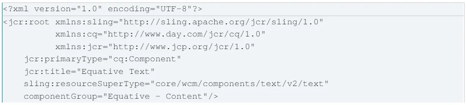
The Proxy Definition (.content.xml)
That’s it. You now have a fully functional text component that inherits Core’s Sling Model, HTL, and clientlibs
— without writing a single line of Java or HTL. You own the component; Adobe maintains the engine.
When to Override the Dialog
Core Components use Granite UI dialogs stored under /libs. If you need to restrict dialog elements for brand
compliance, use a dialog merge in your proxy — never copy the whole dialog. Use the sling:hideChildren node
to suppress elements you don’t want. This keeps your dialog lean and means when Adobe updates the base
dialog, you only verify your overrides — not remerge an entire XML tree.
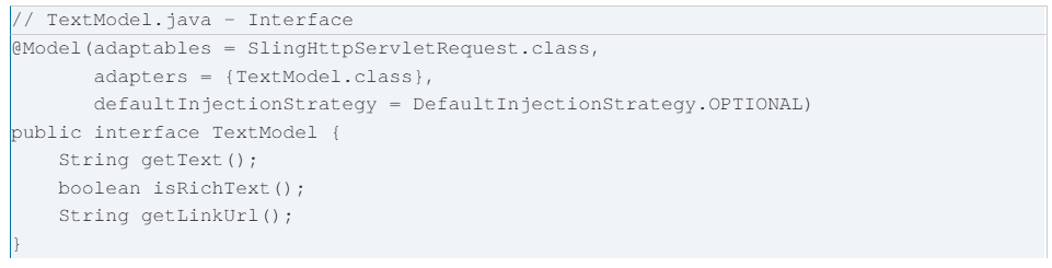
The Interface-First Pattern
Always define your Sling Model as an interface first, especially for components you intend to expose via Sling
Models Exporter for headless/API use.
The interface split means when you test, mock, or swap implementations, you target the interface — not the
concrete class. It also makes your HTL cleaner because data-sly-use resolves the interface.
The @PostConstruct Pattern for Derived Data
Never do heavy computation in getters — they may be called multiple times during rendering.
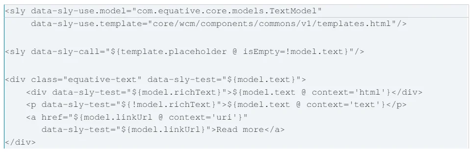
HTL (HTML Template Language) is intentionally constrained — that’s a feature. Use those constraints to
enforce separation of concerns.
Key rules: always specify @ context on every expression (never omit — XSS risk), use data-sly-test for
conditionals, and always include the Core placeholder call for empty-state handling.
The Style System is the most underused feature in AEM. It directly addresses the ‘one component, many
variants’ problem without multiplying components.
Under your template’s structure mode, select a component and open its policy. Configure Style Groups such
as Layout (Default / Full Width / Narrow) and Visual Treatment (Light / Dark / Brand Accent). Wire up the CSS
in your clientlib using BEM modifier classes. An author now applies visual variants through the panel — no
developer ticket required.
One component, multiple combinations, zero sprawl.
The Teaser is the most common ‘real’ component requirement — combining image, heading, body text, and a
CTA. Extend Core’s Teaser via sling:resourceSuperType, add custom dialog tabs (e.g., Analytics Label) via dialog
merge, and wire up your Sling Model to expose the new field as a data attribute for your analytics layer.
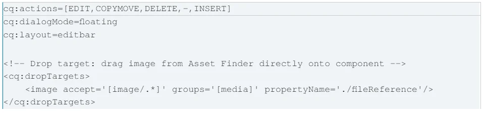
A technically perfect component that’s painful to author is a failed component. The edit config
(_cq_editConfig.xml) controls the in-context editing experience.
Drop targets are the single biggest author experience improvement you can make for image-heavy
components. Authors drag assets directly onto the component — no dialog navigation required.
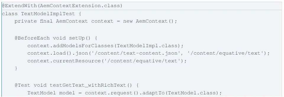
Test the model, not the rendering. Rendering tests belong in your Selenium/Cypress suite against a real AEM
instance.
Core Components are versioned (v1, v2, v3…). Know when to create a new version of your own component:
Next in the series: AEM Dispatcher and CDN Caching Strategy — how component-level caching rules interact
with personalisation and A/B testing use cases.
#AEM #AdobeExperienceManager #CoreComponents #SlingModels #HTL #ComponentDevelopment #EquativeSolutions